UX/UI Design/ End to end process from research to UI design and testing
Timeline:
November _ December 2024
What did we do?
We enhanced PayPal’s P2P transaction process by increasing transparency and simplifying the steps to make it more straightforward. In collaboration with a mentor, we redesigned the app to speed up the process and improve transaction efficiency.
What is the problem?
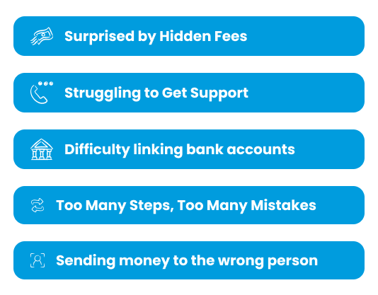
While PayPal is one of the most widely used services for p2p transactions, we noticed certain aspects such as unclear transaction fees and conversion rates could be confusing to most users. So we decided to focus on solving these problems.
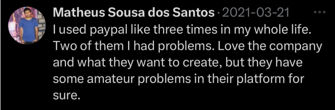
A single tweet sparked our journey to uncover if there’s a real issue with PayPal.
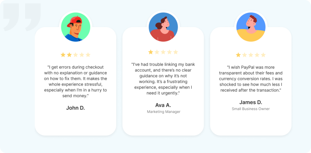
We decided to dig deeper and analyse more user reviews
According to user reviews:
While PayPal is known for its simplicity and security, it struggles with limited guidance, challenges in linking bank accounts, unclear fees and conversion rates, and the risk of sending money to the wrong person. Additionally, the automated customer support provides little assistance.
When it comes to money, people expect every interaction to be clear, reliable, and stress-free.
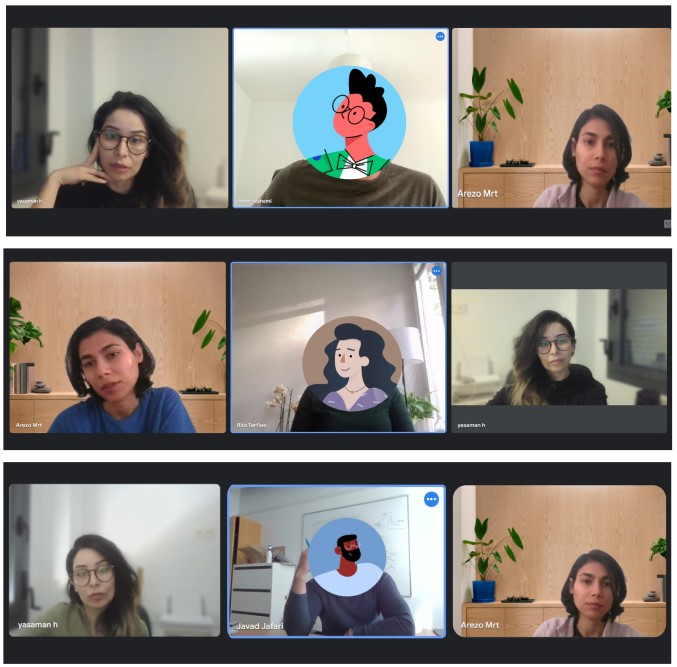
Behind the scenes
We talked to some of PayPal’s users
Approach:
We targeted users aged 30-40 with 2+ years of PayPal use. We recruited 6 participants (4 men, 2 women) to capture valuable insights.
We noted down user feedback from interviews and user insights, focusing on questions like:
Who uses PayPal’s P2P services, and how often?
What challenges do users face when completing transactions?
What alternative apps do users prefer, and why?
Why do users abandon a transaction midway?
How do users feel about contacting PayPal support?
How do users feel about the clarity of PayPal’s fee structure?
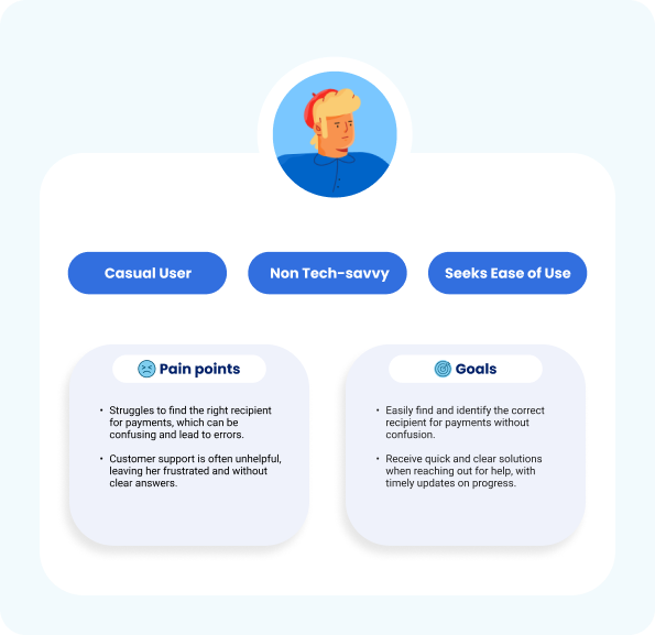
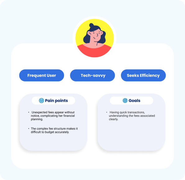
From our research, two key user personas emerged. we brought their stories to life; it helped us understand their needs and share ideas with team clearly and easily.
Looking at what exists
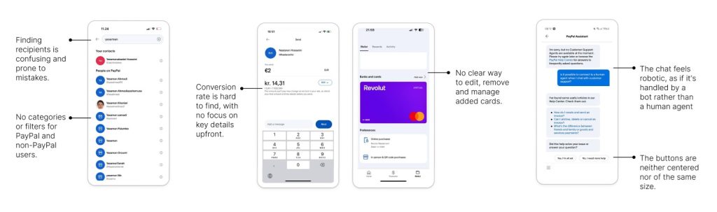
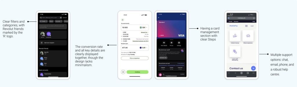
How it looks in peers’ services?
We looked at how PayPal’s peers handle similar challenges and found design ideas that inspired our updates.
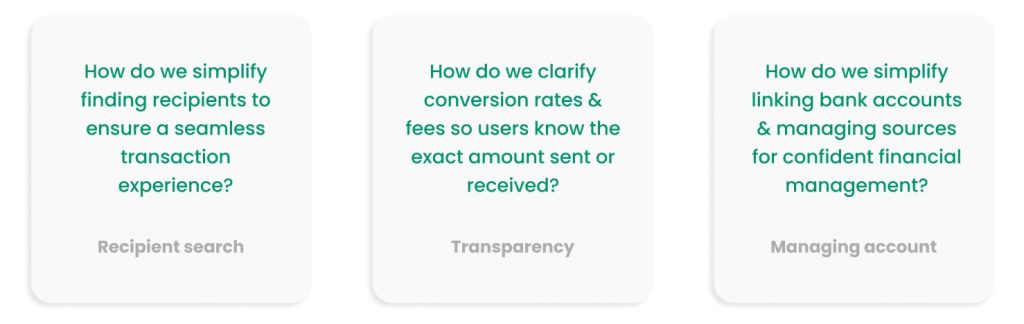
Defining the problem
After reviewing our old designs and checking out similar products, We framed our challenge as a simple question to spark creativity and guide our brainstorming. This approach kept us focused and inspired innovative solutions.
On a mission to solve
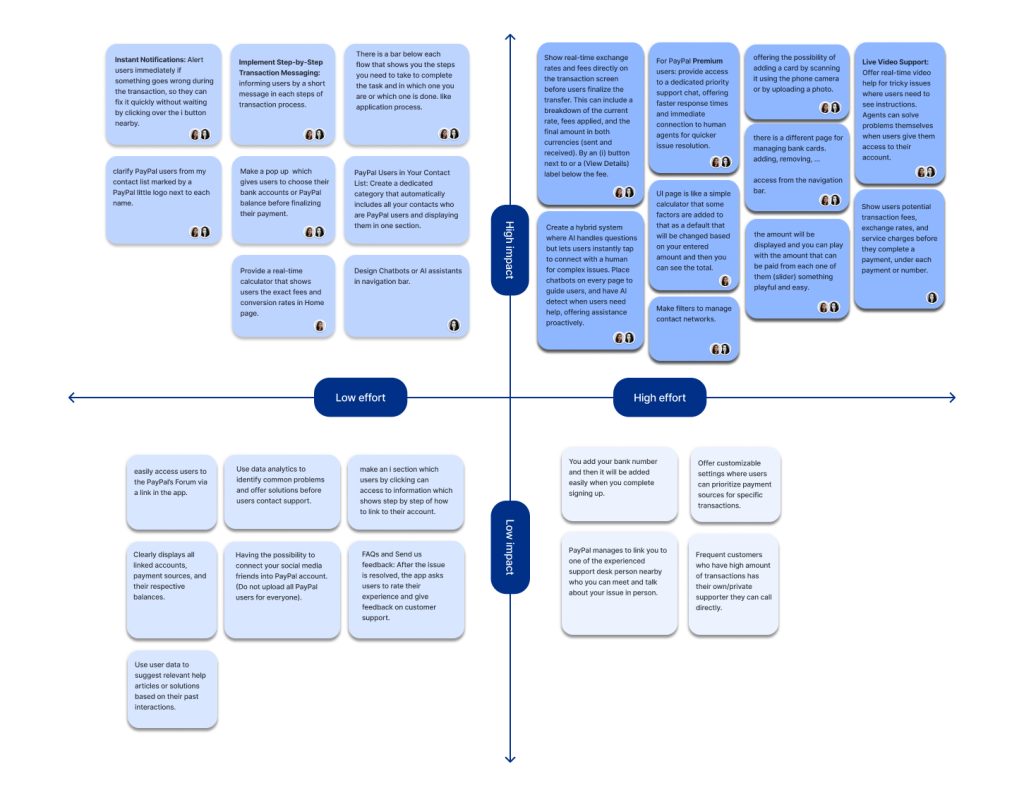
Focusing on our ideas
We mapped out our ideas to see which ones could create the biggest impact. This simple approach helped us quickly prioritize and focus on the most effective solutions. * We involved developers and other designers to generate more ideas.
Turning Challenges into Solutions
We approached each challenge as a chance to think differently. This mindset sparked fresh ideas, allowing us to craft a solution that would truly stand out.
Chances to enhance
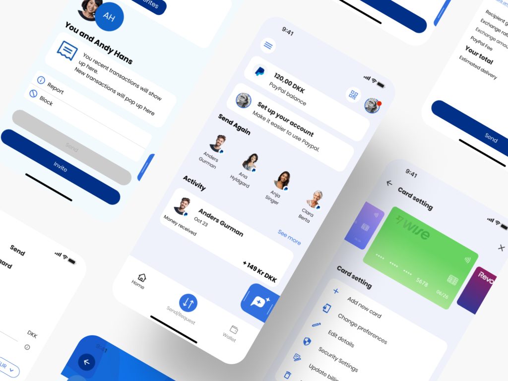
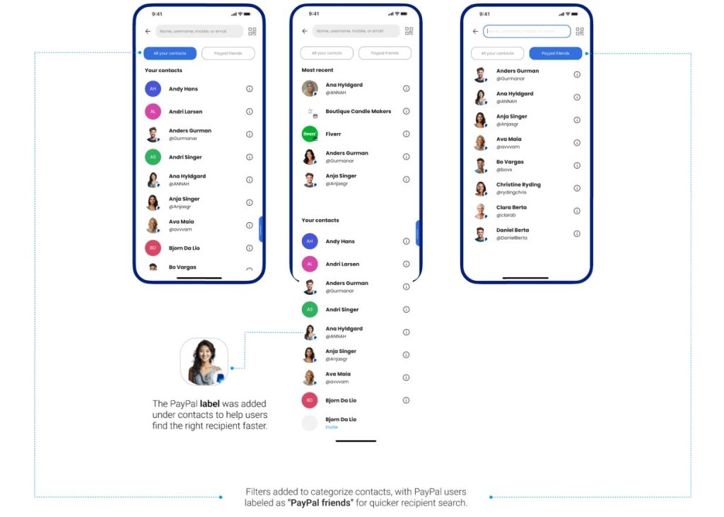
Solution 1:
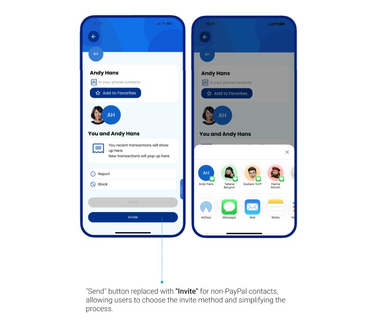
Simplifies recipient finding with categorized contacts, smart suggestions, and a dedicated filter for PayPal users, making the process seamless and stress-free.
“I want to find the person I’m paying quickly without any hassle.”
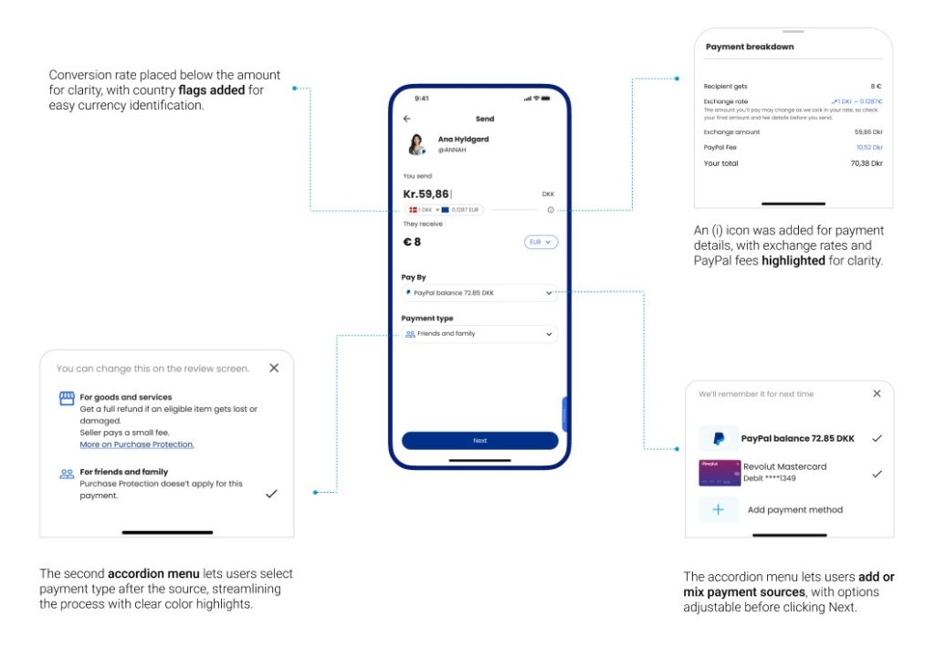
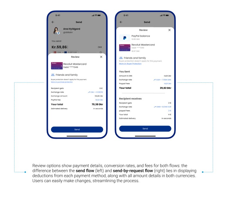
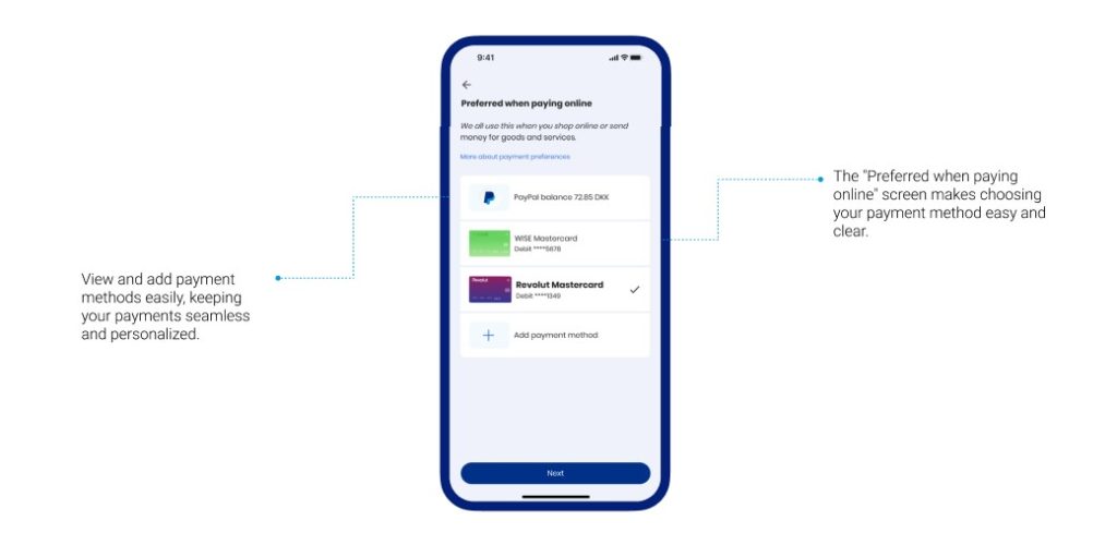
Solution 2:
A detailed summary shows live exchange rates, transparent fees, and the exact amount the recipient will receive; all before confirming the transaction.
“I want to know exactly how much I’m sending and what it will cost me.”
Solution 3:
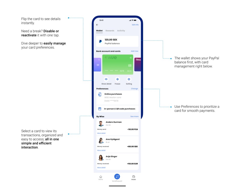
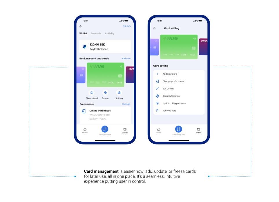
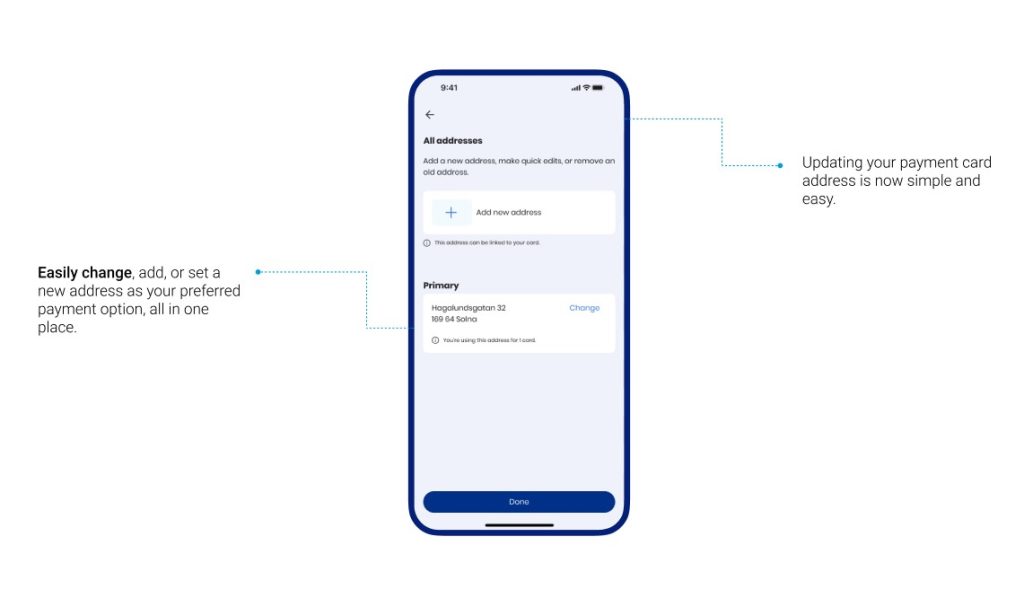
Integrates card management into the wallet, allowing users to link bank accounts, manage payment methods, and update preferences effortlessly in just a few clicks.
“I want an easy way to link my accounts and keep my payment options organized.”
Solution 4:
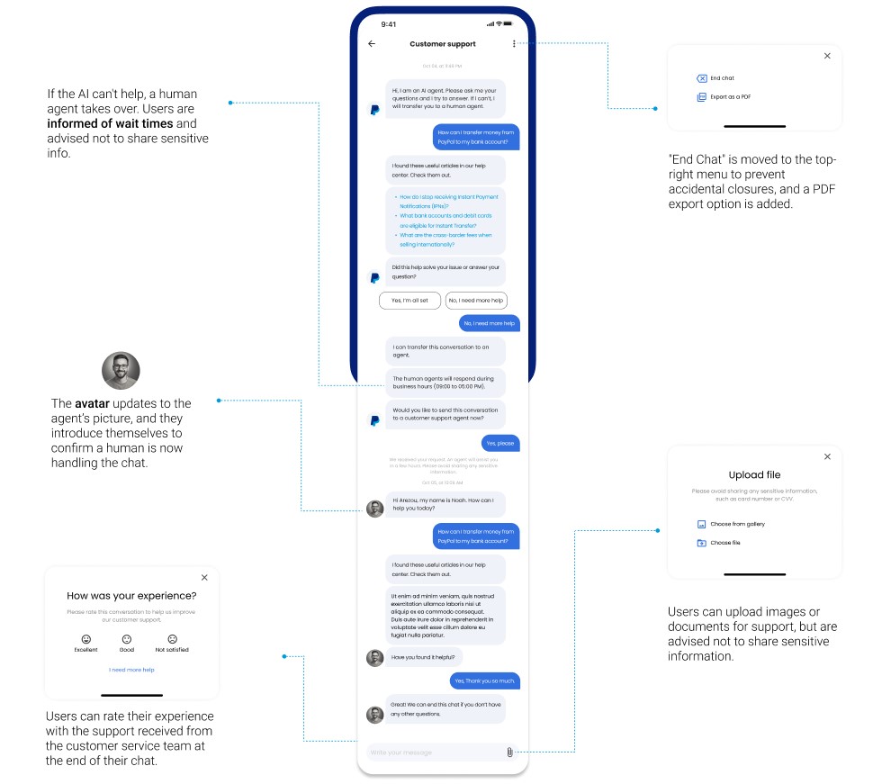
A support system with instant chat access, categorized issues for faster navigation, and an intuitive help center that solves problems effortlessly.
“I want quick and easy support when I face an issue.”
Solution 5:
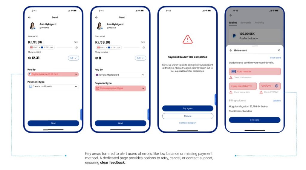
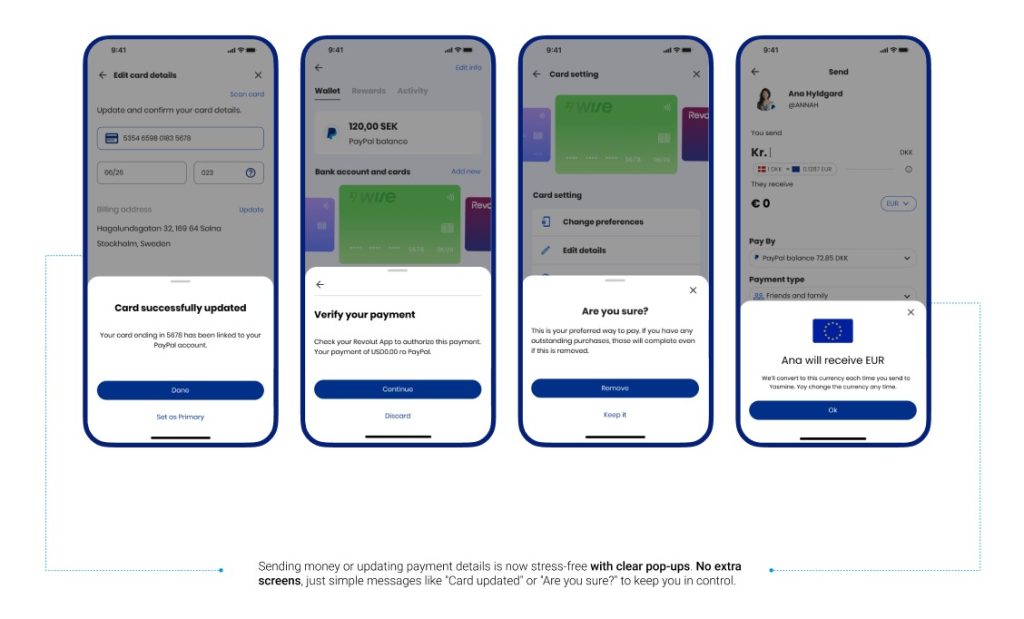
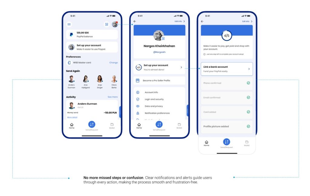
Delivers real-time alerts with straightforward instructions, ensuring users are informed of any issues or missing steps, making the resolution process quick and easy.
“I want clear guidance when issues arise or steps are missed.”
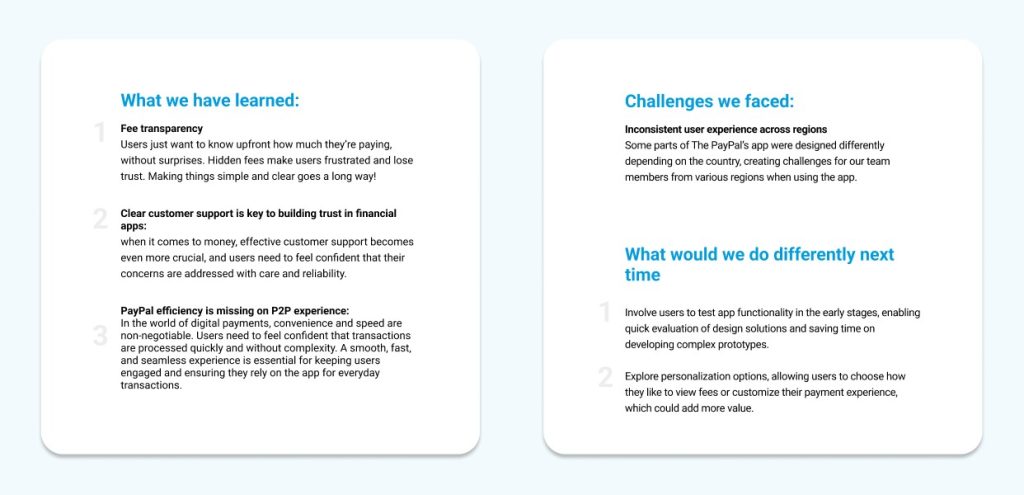
The changes we made really improved what existed, and we felt we were getting closer to our goals. The transaction process now feels clearer, making the payment experience better.
But, are we really getting it right?
Let’s test these solutions
We decided to conduct a series of usability test to see if users find these solutions as seamless as we had imagined.
Approach:
We conducted 3 usability tests to evaluate PayPal’s P2P improvements. Each test included 2 tasks, assessing functionality based on four criteria:
Ease of use
Error rates
Time on tasks
General satisfaction
Result:
The overall user satisfaction rating was 4.6 out of 5, with 4.8 for engagement and 4.3 for ease of use.
Users were positive about the experience but shared some thoughts on how it could be even smoother.
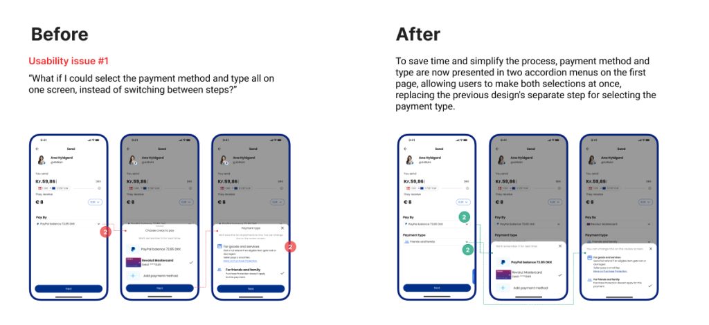
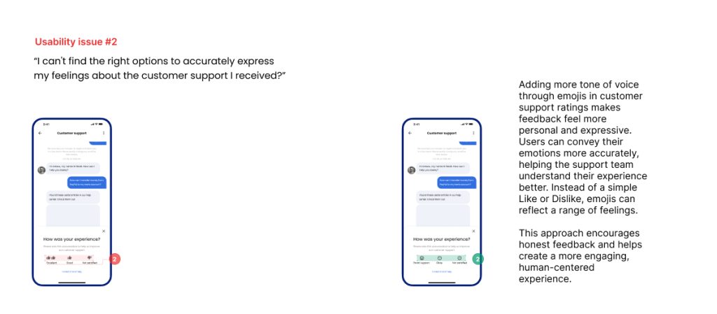
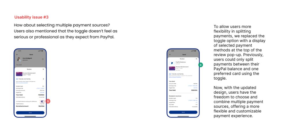
They expressed a preference for a more intuitive flow when selecting payment methods
More ways to provide feedback on customer support
Greater flexibility in managing payment options
They also suggested that certain features could better reflect PayPal’s professional tone.
These insights guide us toward creating an even more seamless and user-friendly experience.
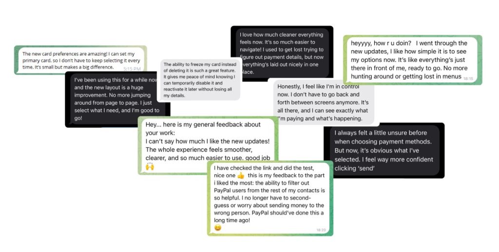
“It brings a smile to users’ faces and makes them excited to share their experience!”
And guess what?
Users are sharing their excitement about PayPal’s improvements, feeling more secure and confident with the updates!